Skip to main content


Over 50% of searches happen on mobile devices.
This means that you could lose 50% of traffic if your site isn’t optimised and responsive.
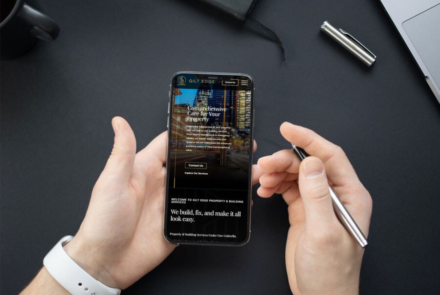
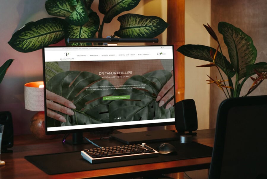
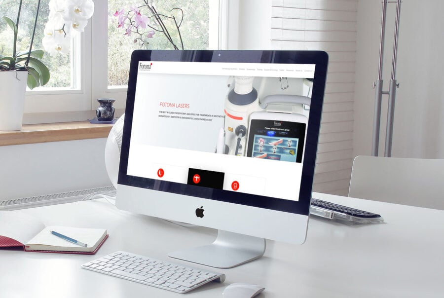
With responsive web design, your website can seamlessly adapt to various screen sizes and resolutions. Whether a user is browsing from a desktop, laptop, tablet, or smartphone, the layout will automatically adjust to ensure an optimal viewing experience. It’s like having a website that’s tailor-made for every device.
At Leap Digital, we’re not just another web design company. We’re a team of experts who understand the local market. Our research shows that your website is more likely to be accessed via mobile (54.06%) rather than a desktop. This insight is crucial for your business to stay competitive in today’s digital landscape.
Google also says that a bad mobile experience can drive 61% of users away, with 40% going to your rivals instead.
That’s why we specialise in responsive web design in Essex, London, and overall the UK to get the best exposure for your website.